
Project name: Sales Analysis
The main aim of developing this Product sales analysis QlikView application is to analyze the total sales data in a company year wise, month wise and week wise and day wise.
This analysis includes the ratio of sales data, profit maximization, etc.
The Analysis has done with the below 4 Charts namely Bar Chart, Pie Chart, Pivot Table and Straight Table.,
Bar Chart:
A bar graph shows comparisons among discrete categories. One axis of the chart shows the specific categories being compared, and the other axis represents a measured value.
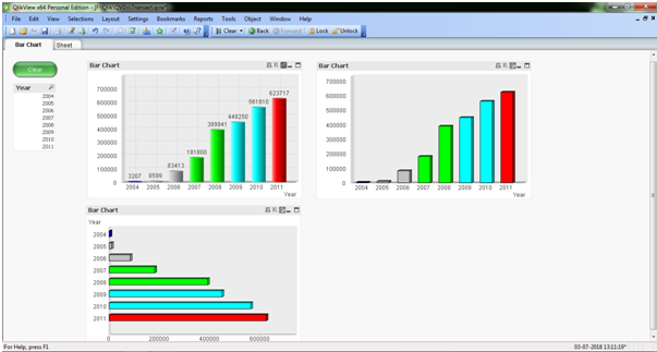
In the above screen, it shows the different types to represent the Bar Chart (Sum of Sales per Year)
Pie Chart:
A pie chart (or a circle chart) is a circular statistical graphic which is divided into slices to illustrate the numerical proportion
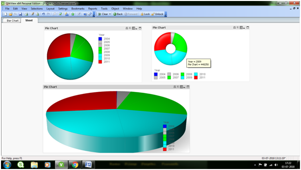
In the above Screen, it shows the different ways to represent the Pie chart (Sales per Year)
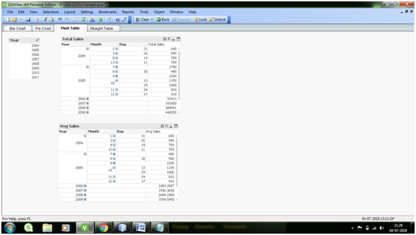
Pivot Table:
Pivot Tables are widely used in data analysis to present the sum of values across many dimensions available in the data.
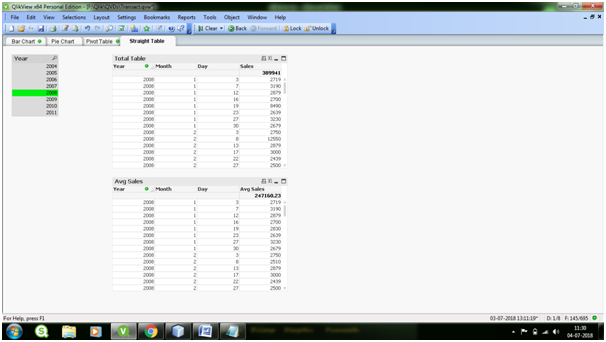
Straight Table:
Straight Tables are the most widely used sheet object to display data in QlikView. They are very simple yet powerful with features like column rearrangement, sorting and coloring the background etc.
Download the Product Sales Analysis Qlikview Project