K-means clustering and DBSCAN algorithm implementation. The below work implemented in R
1. Implement k-means algorithm in R (there is a single statement in R but i don’t want. that) and need complete algorithm will should run according to ocean data set variables. It is a time series data.
2. implement DBSCAN algorithm in R.
Here the result will be a clusters. by user defined k and based distance values…
And finally the two algorithm results compare and correlate..
NOTE: These two algorithms are very simple and well known too.
Goal of the work:
K-Means Algorithm:
1.Implement k means algorithm for ocean data set( the data set it contains input variables like sea surface temperature, water temp depth at meter level,wtd20m wtd30,……etc)
Based on Distance calculations equations (i.e Equaliden distance, Menhaten distance) the clusters are formed it is algorithm logic. It is there in R already implemented in two dimension..(X axes and Y axes)
Write a code for three dimension (X-axes,Y-axes,Z-axes)
that means if it is X-axes variables statement one is executed or of it is two variables statement two (X and Y axes )executed or three variables (X,Y,Z axes) statement executed.
note: Every statement result will be stored in object
and that what ever the cluster we got according to algorithm it could be displayed in graph.
2. implement DBSCAN algorithm based on algorithm steps.
finally the both results display in graph format.(for correlation)( for example it is like our cricket two innings score graph)
The above two steps are according to algorithms.
This Project is with the programming or the analysis. If you need the programming, It will be with the R codes and functions, where you can input any variable and get the results you desire. Else If we require the analysis, we have to specify which variables to include because, there are 145 variables in all, and no graph or clustering technique can deal with 145 variables at a time.
Based on results algorithms we can analyse so for that use sea surface temp,wtd depth in different levels and date variable finally sub surface temperature.
Note: The final goal is for analysis based on cluster formation (code results)
And the output of the clusters will be in visualize in image formation..
Related Questions:
1.How should the algorithms works for any ocean data? Is it run for all data sets?
2.How should we give input values for K-means and DBSCAN and where it is?
3.In the results there is no monthly representation in any of the axes.( example : if we give k=12 that shows 12 clusters, the entire data set divided into 12 clusters so if cluster 1 is red in colour you months in X-axeas for representations.
4 The results showing individual graphs in final.it is ok. But we also need both two results in single graph.
5. how should data set reads in that code? How should i give any of the variables for clusters.
6. Is that algorithms runs individual ? I need individual execution.
Please use the R file named “Rmodified” that i sent with the instructions in a zip
Secondly any cluster plot displays distance matrix, in 2D and not clusters on basic scatter plot. however after running the codes, with the same variables as in the video, run these 3 commands, and you will get a scatterplot with the clusters of different colours.
par(mfrow=c(2,1))
plot(a,col=c1$Kmeans,main=”K means”)
plot(a,col=c1$dclus,main=”DB SCAN)
but in 3d, we don not get distances, because a 3 dimensional distance is basically of no use. hence in 3d we get a 3d cluster plot
It is made to deal with missing values
to enter from a CSV file use a variable, say file, to store the CSV file.
file=read.csv(“path of file”, header=T)
then extract the variables from the file
x=file$”input the column name of 1st variable you want”
y=file$”input the column name of 2nd variable you want”
then
a=as.matrix(cbind(x,y),ncol=2) and then the usual method.
and between i am using 3.2.2
Answers:
1. The data will work for any data set and any set of variables.
2. All instructions are given below
3. Please follow instructions
4. Overlaying the same variables with different cluster method on a single graph is not possible.
This is because, suppose a point is marked as red according to a cluster of DBSCAN,now if it has to represent a cluster of kmeans then it should have a different colour according to the kmean clusters. This is a contradinction as a point can be of only one colour at a time. Again if the point is red according to both clusters, then how can you differentiate between the two cluster methods? You can search the web for reassuarance.
5.Follow instructions
6.Follow instructions
This is a custom function in R, and works like any other functions that you use in R like mean(), sd(), kmean() etc
However as this is custom, you need to run the algorithm before you can apply the function.I have simplified it further for your convinience
Firstly download the graphics packages, if you do not have them already :
1. dbscan
2. rgl
3. cluster
to download go to packages -> install packages -> select CRAN server -> search and click from the list of packages
Secondly, run the code except for the last line that states cluster(…)
Now, you are ready to use the function named cluster that i defined. It has a set of parameters.
However you need to follow the order of the parameters as this is a custom function.
the first parameter in the function is a matrix. this is where you put your variables after converting them to matrix.
to convert to a matrix simply use as.matrix(cbind(x,y,z),ncol=3)
where x,y,z are the variables and ncol is the number of variables. you can use 1 or 2 or 3 variables as you require.
But if you put 4 or more, you will not get the graph, because R cannot produce graphs in 4 or higher order dimensions.
Next you have value of epsilon for DBscan
next Minimum points of DBSCAN
next the dimension of the matrix, i.e. number of variables combined into matrix
next you have number of clusters for kmeans
next you have Xaxis, Yaxis, and Zaxis labels for the graphs
and lastly you have the option of putting in any extra variable like months, years etc that will not be clustered,
but will be plotted against the X-axis.Howvever you can ignore this if you do not require it.
However,adding an extra variable with low correlation
will definitely take in another dimension of the graph. That means if you have 2 variables it will produce a 3d graph.
If you already have a 3, R cannot go further and hence will display error.
#####The Program being an custom one can take time to compute depending upon your conputer and data set.
it can take as long as 2 or 3 mins, so have patience.######
Here is an example,
cluster(x,2,3,2,5,”Xaxis”,”yaxis”,”zaxis”,y)
######please maintain the order of parameters and write it in the above format#########
However as this is not a default function, do not use it in this way
cluster(matrix=x,epsilon=2….) this is not right. The previous one is right.
To avoid compilation error, please do not skip any parameter except for the optional variable and name of zaxis when not required
You can also store the value of the function in a variable, and use specific information from it later
eg
a=cluster(….)
then
a$dbscan will display results of DBSCAN
a$dclus will give the cluster compositoin of DBSCAN
a$KMmean will give mean vector of K-means
a$Kclus will give cluster composition of Kmeans
a$Kmeans will display results of K-means
a$SSW will give the percentage of SSW as a part of TSS
The program prepared in R computes the clusters according to both the algorithms and then are displayed graphically for us to compare and analyse. However the number of K-mean clusters have been set according to the number of clusters formed in DBSCAN so as to ease the comparison.
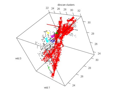
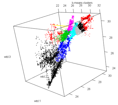
Clustering with wtd.1,wtd.2,wtd.3
DBSCAN
Parameters: eps = 0.2, minPts = 10
The clustering contains 10 cluster(s) and 491 noise points.
0 1 2 3 4 5 6 7 8 9 10
491 15152 29 44 100 64 18 18 11 10 14
The algorithm gives us 10 clusters. So as we see the clusters formed are not well distributed with the first cluster having the majority of the values while the remaining having very low values. However the clustering technique was quite decent because of the fact of such low noise.
K-means
Cluster Number No of elements
1 1 3325
2 2 303
3 3 2334
4 4 1610
5 5 2869
6 6 928
7 7 371
8 8 1349
9 9 1704
10 10 1158
SSB as a percent Of TSS
86.43162
The clustering was quite good as 86%of the total variation is explained by the between cluster variation.


The K-means has even distributed clusters while in the DBSCAN clusters we see a majority of red points that indicate the 1st cluster with the maximum number of observations, and very few other colour points. In this case K-means was a better method as it was able to cluster the various segments of the dataset.
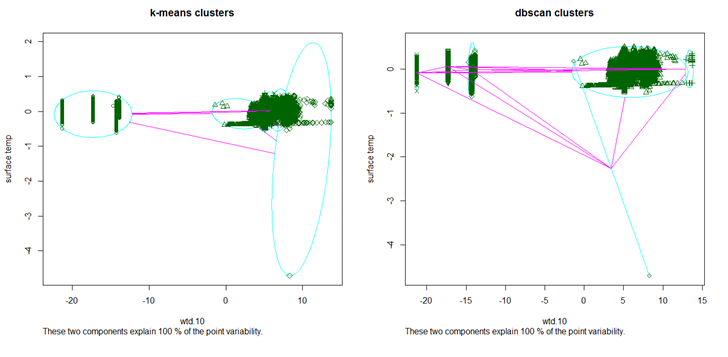
Clustering withwtd.10 and surface temp
DBSCAN
Parameters: eps = 0.8, minPts = 10
The clustering contains 5 cluster(s) and 2 noise points.
0 1 2 3 4 5
2 11406 46 620 2712 1165
In this case we have 5 clusters, that are quite evenly distributed and more over the clustering was extremely good because of the presence of only 2 noises.
K-means
Cluster Number No of elements
1 1 4497
2 2 933
3 3 5158
4 4 2796
5 5 2567
SSB as a percent Of TSS
98.07178
Even in the case of K-means the clustering was very good for 98% of the total variation is explained by the between cluster variability. Moreover the clusters are evenly distributed.

The DBSCAN algorithm is a better method in this case as it has correctly identified the patters in the data, and has formed three separate clusters on the top left. However K-means has not done so well compared to DBSCAN because of the fact that it has formed 4 clusters in the densely populated area which could have been portrayed under one cluster.
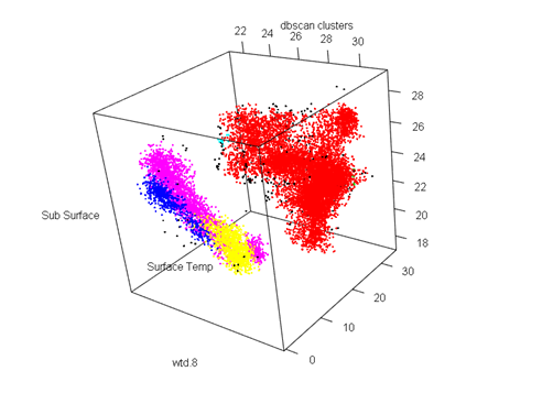
Cluster with wtd.8 and surface temp and sub-surface temp
DBSCAN
Parameters: eps = 0.5, minPts = 10
The clustering contains 6 cluster(s) and 287 noise points.
0 1 2 3 4 5 6
287 11156 18 611 14 2706 1159
In this case we have 6 clusters with a decent number of noise.
K-means
Cluster Number No of elements
1 1 4497
2 2 100
3 3 4737
4 4 2936
5 5 3650
6 6 31
SSB as a percent Of TSS
93.44828
The clustering was quite good owing to the fact that 93% of the total variability was explained by the between cluster variance.


Both the algorithms were equally good in clustering the dataset. While k-means has clustered the broader region into three groups, DBSCAN has the clustered the more scattered region into three different sections.
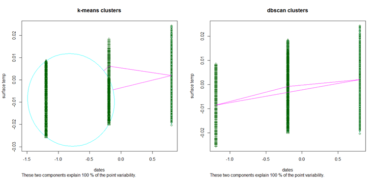
Cluster with dates and surface temp
DBSCAN
Parameters: eps = 0.5, minPts = 10
The clustering contains 3 cluster(s) and 0 noise points.
1 2 3
5168 8731 2052
The algorithm has perfectly clustered the data with no noises. There are 3 broad clusters that are more or less evenly distributed.
K-means
Cluster Number No of elements
1 1 5168
2 2 5627
3 3 5156
SSB as a percent Of TSS
80.2711
K-means however shows a poor clustering, with only 80% of the total variability explained by the between cluster variability.

This is the perfect example where DBSCAN works better than K-means. If we look at the K-means graph we have one big circular cluster on the left and two relatively small clusters on the right. However DBSCAN was successful in identifying the 3 major clusters in the dataset.
Download K-means clustering and DBSCAN Algorithm implementation in R Project Source Code.
